- MarketBeat (WSJ Blog) – Stocks and Bonds: Which Market is Wrong?
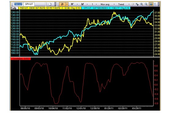
As MarketBeaters know, stocks and Treasury bonds have been telling different stories lately. They still are. Investors are again bidding up the price of Uncle Sam’s IOUs Monday. Check out the yield of the 10-year note — which moves in the opposite direction of the price for the bond — it’s down below 3.3% again. Since investors usually flock to bonds when they’re worried about softer economic growth, you can interpret this to mean that bond investors are so keen on the prospects for the economy. But hold on. Over in the stock market, investors don’t seem to have many of the same concerns. True, we’re pretty much flat for today. But there’s precious little sign that stock investors are moving to ratchet their economic growth expectations much lower. Check out this chart, it shows the yield on the 10-year note (yellow) and the S&P 500 (blue). You can see the 20-day correlation — roughly a month of trading days — breaking down lately. True, the correlation isn’t getting to levels we’ve never seen before. And last time these two came unhinged it was bond yields — not stocks — that had to hustle to catch up. We’d just remind you that the reason stocks started rallying that time around was a little thing called QE2. The Fed’s talking like a QE3 isn’t really in the cards. What do you think? Which market is going to be proved right this time around?
Comment
<Click on chart for larger image>
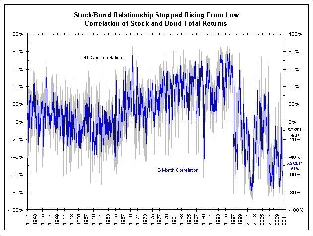
The next chart shows a rolling 3-month and 30-day correlation. These correlations are volatile but we do not believe that they are showing signs the stock/bond relationship is changing.
You could make the case that QE2 or the aftermath of the Great Recession should have changed this relationship, but we have not yet seen evidence this is actually happening.
<Click on chart for larger image>
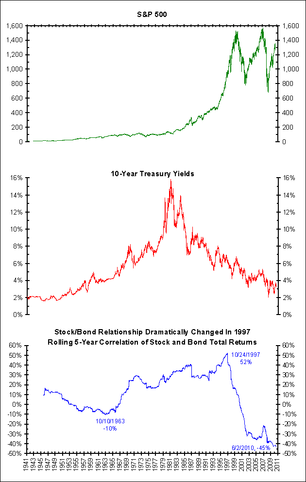
Our guess is that this relationship ends at the inflection point. In other words, interest rates will rise as stocks fall, marking a return to the pre-1997 correlation. We would argue that the event that turned the relationship in 1997 was the real possibility of deflation. Perhaps inflationary fears will change it back to a pre-1997 relationship.


It is too early to say the stock/bond relationship is changing. Even the chart above shows, this correlation has had several such divergences in the last nine months.
In our stock/bond charts below, we correlate price movement (not yield) to stock prices. This gives us a negative correlation. As the third panel of the next chart shows, the correlation between yields and stocks has been negative since 1997 (not 2007 as Bloomberg says). This followed a period from the early 1960s to 1997 during which the stock/bond relationship was generally positive.