Comment
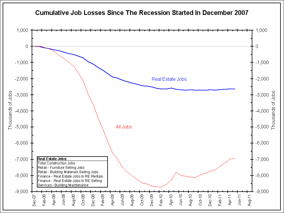
Below is a chart showing the cumulative losses in real estate jobs since housing peaked. This industry has yet to recover from a jobs standpoint.
<Click on chart for larger image>
<Click on chart for larger image>
<Click on chart for larger image>
<Click on chart for larger image>
<Click on chart for larger image>
<Click on chart for larger image>
- Calculated Risk (blog) – May Employment Report: 54,000 Jobs, 9.1% Unemployment Rate
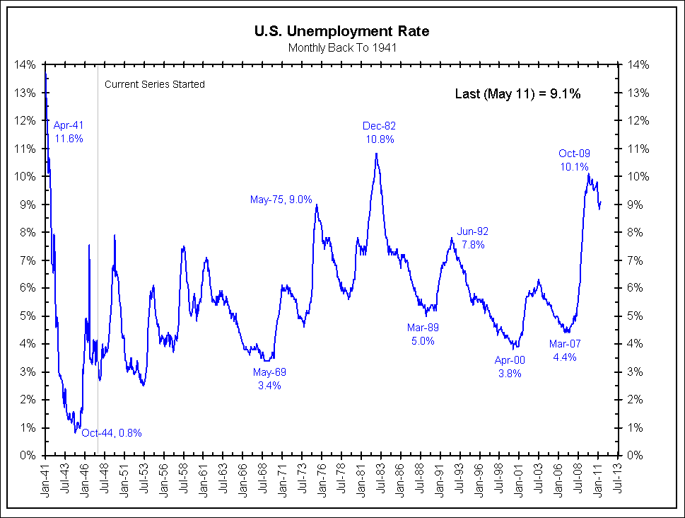
Nonfarm payroll employment changed little (+54,000) in May, and the unemployment rate was essentially unchanged at 9.1 percent, the U.S. Bureau of Labor Statistics reported today. Job gains continued in professional and business services, health care, and mining. Employment levels in other major private-sector industries were little changed, and local government employment continued to decline. … The change in total nonfarm payroll employment for March was revised from +221,000 to +194,000, and the change for April was revised from +244,000 to +232,000.
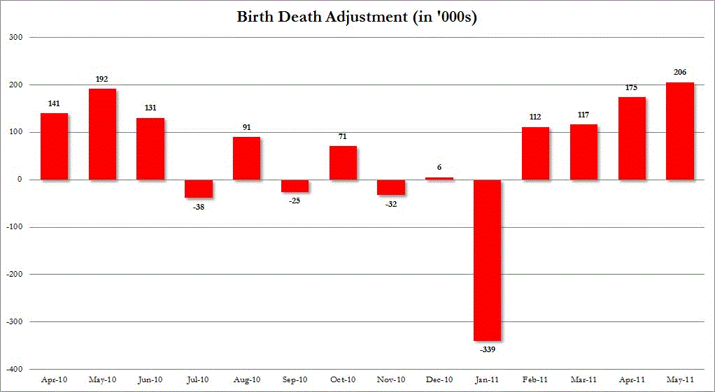
- Zero Hedge (blog) – Birth/Death Adjustment+ 206,000!
Take away the Birth/Death adjustment of 206,000 and the Real NFP is: -150,000. This is the biggest monthly B/D adjustment in over a year. And if as all the pundit claimed last month, demanding the McDonalds addition of 62,000 janitorial, part-time jobs be added to the May number, the economy really lost over 200,000 in May. Time to price in QE 666.