Summary
Comment
In our Employment in Pictures update on Friday, we noted:
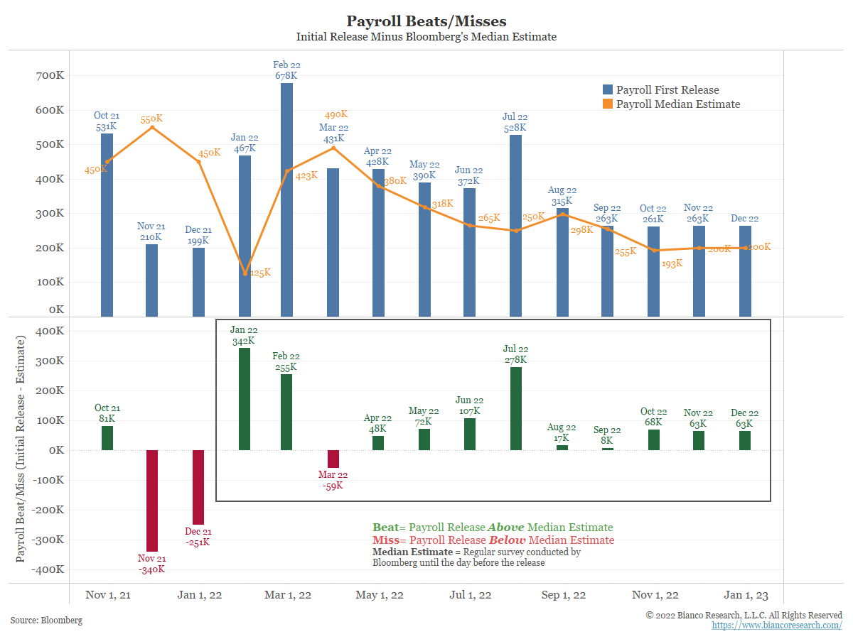
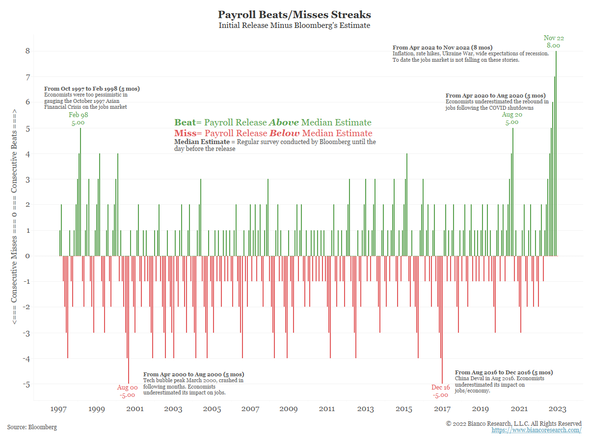
Today’s upside beat was the eighth straight month that economists underestimated the actual release. Perhaps economists are convinced aggressive rate hikes will kill the labor market, creating a bit of a bias in their estimates.
Listed on the chart are possible reasons for the previous streaks. They can all be explained by incorrect assumptions by the consensus of economists.
Sum it up and the labor market is giving every indication it is strong. This was the market’s interpretation at the start of the day, but by the end of the day, Wall Street had convinced itself the report was really poor. Talk of a 2023 Fed “pivot” was back on the table.
Low Response Rate
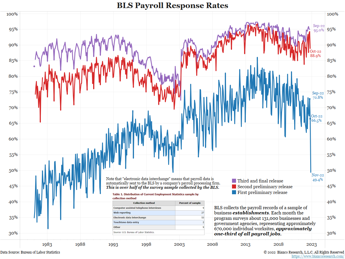
The payroll report is derived from a survey of businesses. The November release had the lowest response rate in 32 years (blue line).
We talked to the Bureau of Labor Statistics (BLS) to get some color on this drop in the response rate shown in blue. The payroll survey week is the Saturday to Sunday that contains the 13th.
- The October survey week ended on October 16 (the 13th was Thursday).
- The survey week for November started November 6 (the 13th was a Sunday)
This means there were only 20 days between survey periods. Additionally, the November survey week included a holiday, Veterans Day (11th). These factors led to the historically low response rate.
Note on the table above that 53% of the survey is collected via “electronic data interchange.” This means payroll data is sent automatically to the BLS by the company’s payroll processing firm.
We were told three very large firms did not report (one accidentally resent their October data). These firms have subsequently reported and will be included in the first revision next month. The BLS rep did not tell us who these firms were or why they did not report/sent the wrong data.
If we had to guess, maybe it was a coding/software error at a major payroll processing firm like ADP (a complete guess used as an example). Maybe all three of these companies used the same firm.
Regardless of the exact reason, the BLS fully expects the response rate to jump back to historical norms upon the second release.
Why Does This Matter?
The BLS modeled or interpolated on the missing 51% of the survey. In other words, they filled in the blanks for now and will adjust as more survey data is available.
The BLS believes it is impossible to guess which direction that revision will be, but it is reasonable to guess a larger-than-normal revision is coming. We agree a large revision is a likelihood.
That said, we believe the number will be revised higher. Why?
The BLS’s guess is pretty much in sync with the consensus on Wall Street. What do we know about the consensus? They have guessed too low in the last eight consecutive reports and in 10 of the last 11. They are setting records for consistent one-sided forecasts.
So, if the BLS’s modeling/interpolation of the missing 51% proves to be similar to Wall Street’s consensus, we could see the number revised higher.
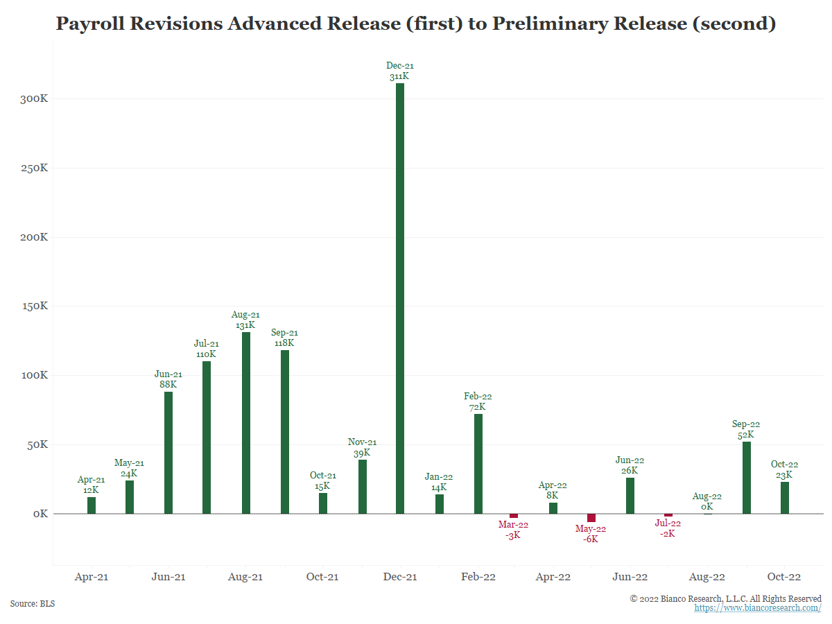
There is evidence this is happening at the BLS without a low response rate.
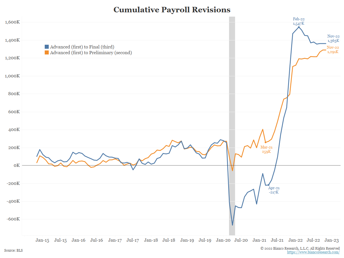
The next chart shows the direction of the revisions in the payroll report between the advanced (first) report and the preliminary (second) report. The revisions are almost all in the same direction – higher.
Establishment vs Household Survey Divergence
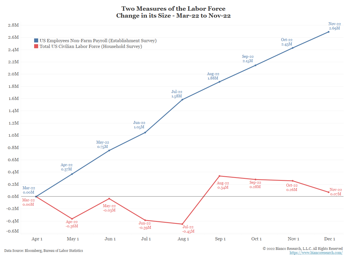
The blue line in the chart below shows the cumulative change in employees according to the establishment survey (payrolls). Since March, it shows 2.69 million jobs have been created.
The red line shows the cumulative change in the labor force according to the household survey. It is a survey of about 60,000 eligible households conducted by the U.S. Census Bureau for the BLS. This report is used to calculate the unemployment rate (they ask if you have a job).
The household survey shows only 70,000 jobs have been created since March. The gap between these two reports is massive.
Given the assumption is a recession is coming, Wall Street engaged in a discussion to convince itself that the red line (household survey) is correct and the blue line (the establishment survey) is wrong.
There is no definitive way to say which survey is more correct than the other one. They measure different things.
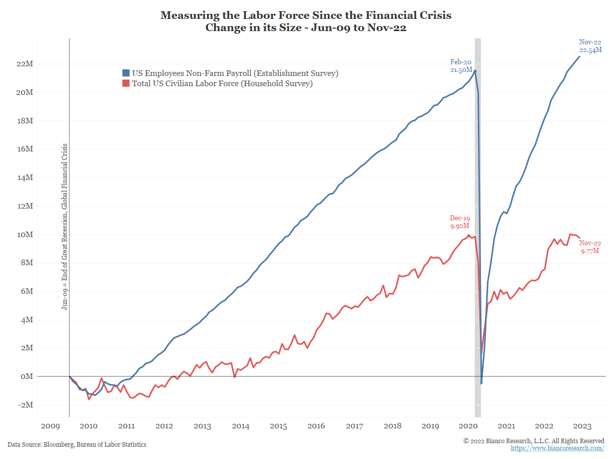
Given this, note the following chart. It is the same as above, but it begins at the end of the Great Recession in 2009.
The establishment survey shows almost 23 million more US jobs over the last 13 years. The household survey shows under 10 million more jobs over the same period.
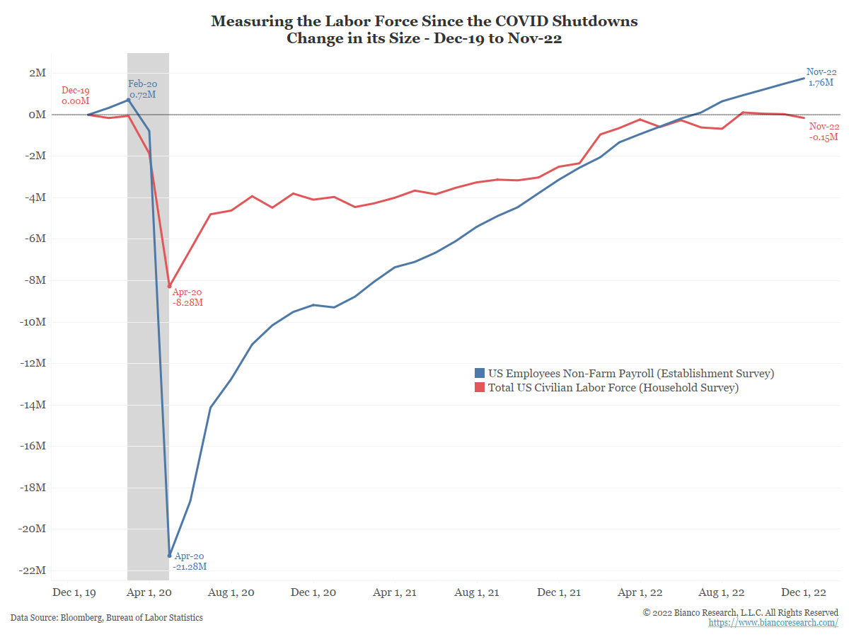
Finally, the chart below simply changes the start date to December 2019 to line up with the start of the pandemic.
The establishment survey (blue) says 21 million were laid off during the shutdowns. The household survey says only 8.28 million actually lost their job.
Again, payroll processor data shows 21 million stopped getting a paycheck after the COVID shutdowns.
Sum it up and it is impossible to say one survey is “more correct” than the other.
Conclusion
Wall Street decided the establishment survey showing 2.69 million more jobs since March is wrong and the household survey showing 70,000 more jobs is correct. We would argue they are making this claim because it fits their narrative of a recession and the hope that cheap money is on the way.
