Summary
Comment
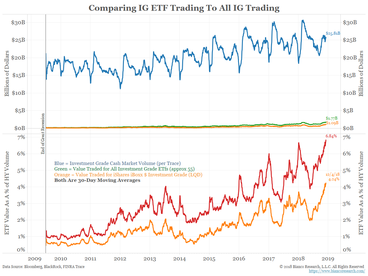
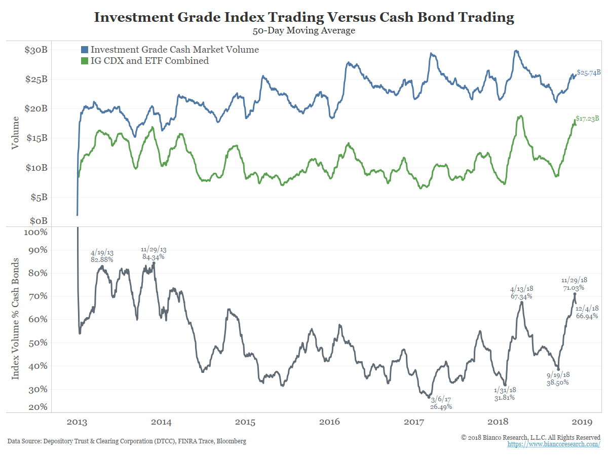
The indexation of the high yield bond market has been a recurring theme of ours. Here we detail it and compare it to the investment grade market, which is less idiosyncratic and also less indexed.
The Rise of CDS, the First Iteration of Indexation
The chart below shows the value of all credit-default-swaps (CDS) outstanding worldwide. This data comes from the Bank of International Settlements and covers all credit-related instruments. Both investment grade and non-investment grade ratings are included in this measure.
The amount of CDS outstanding skyrocketed until the Great Recession (shaded) and has dwindled since.
Note that multi-name CDS (CDX) are now equal to single-name CDS (orange) in size.
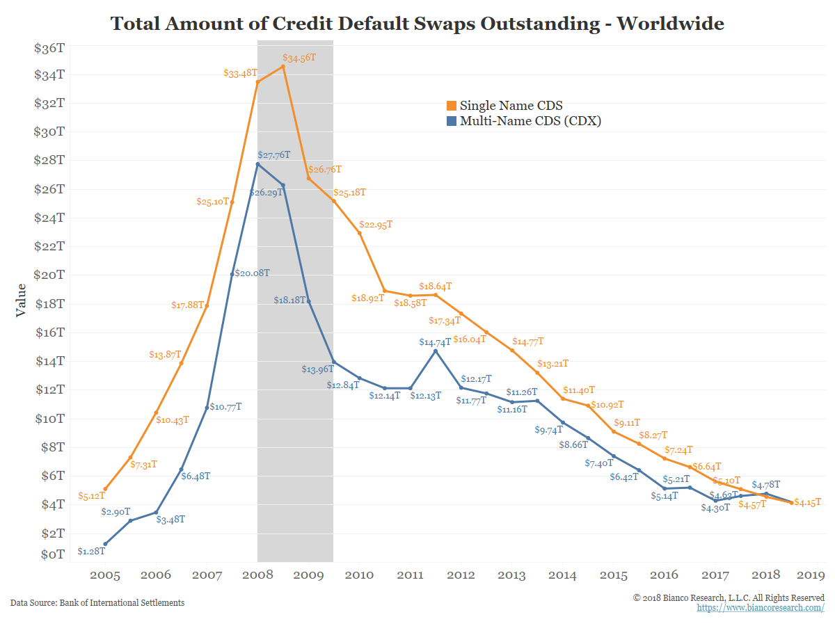
The rise (and subsequent fall) of CDX was the first iteration of indexing the corporate bond market. Because of the Great Recession and subsequent regulation, we have a lot more detail on these markets.
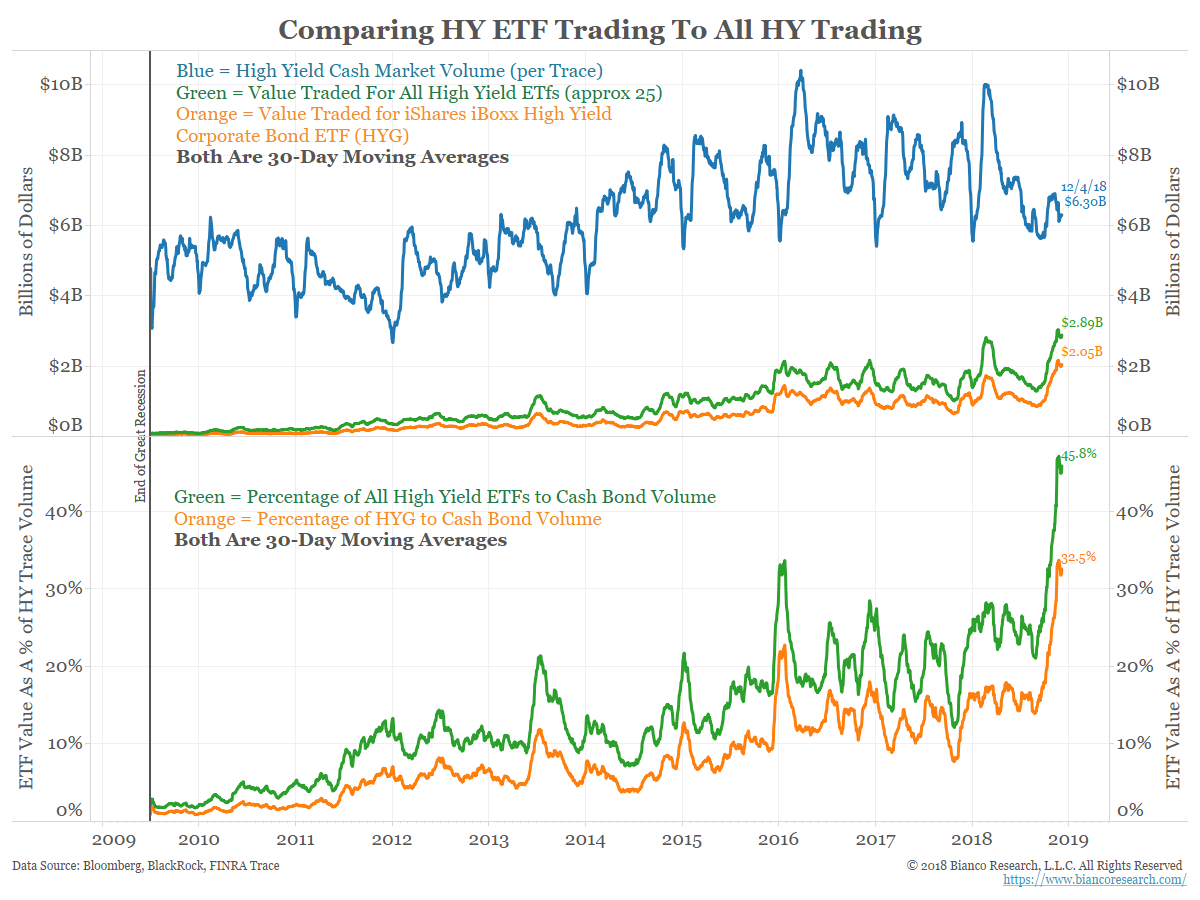
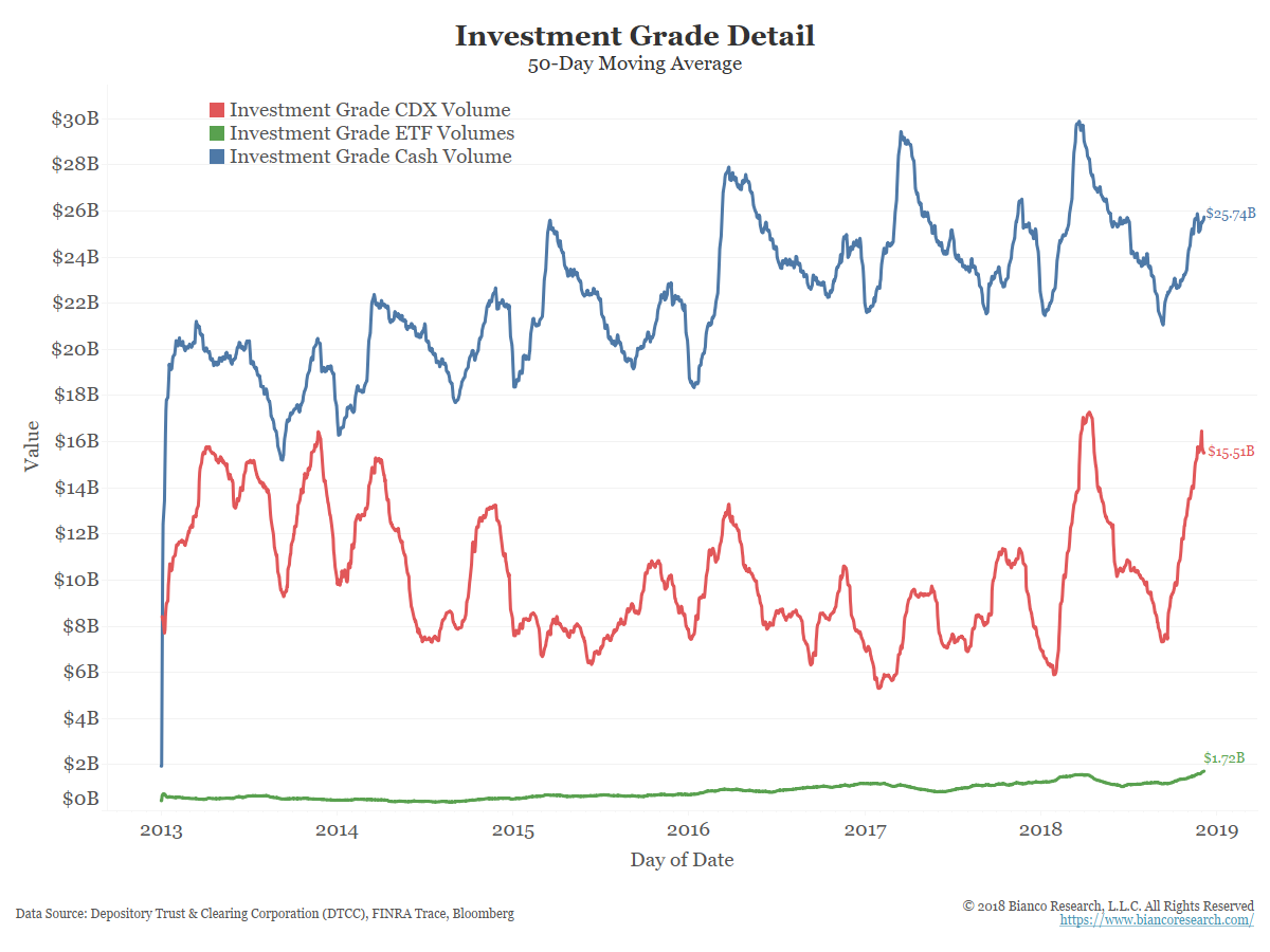
The next set of charts shows the rise of the next wave of corporate bond indexing via ETFs.
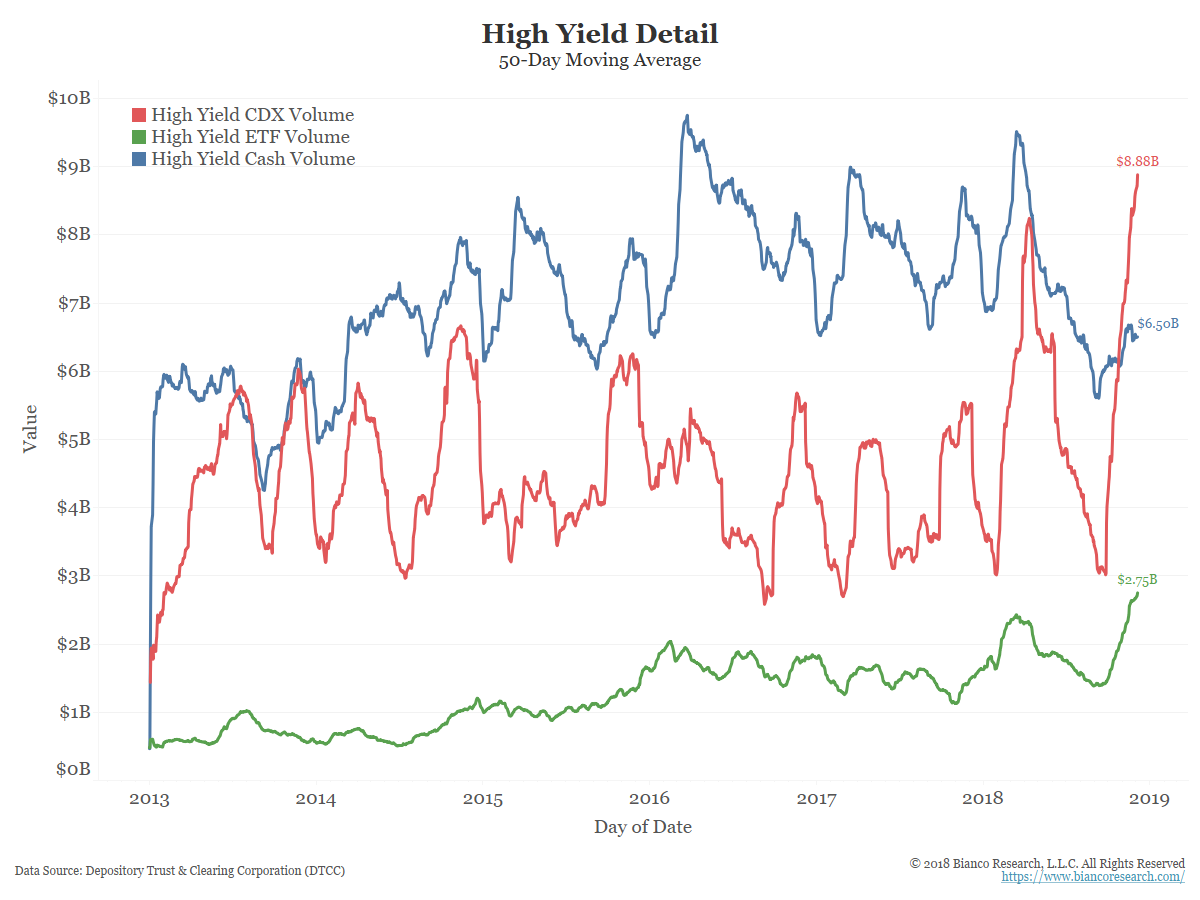
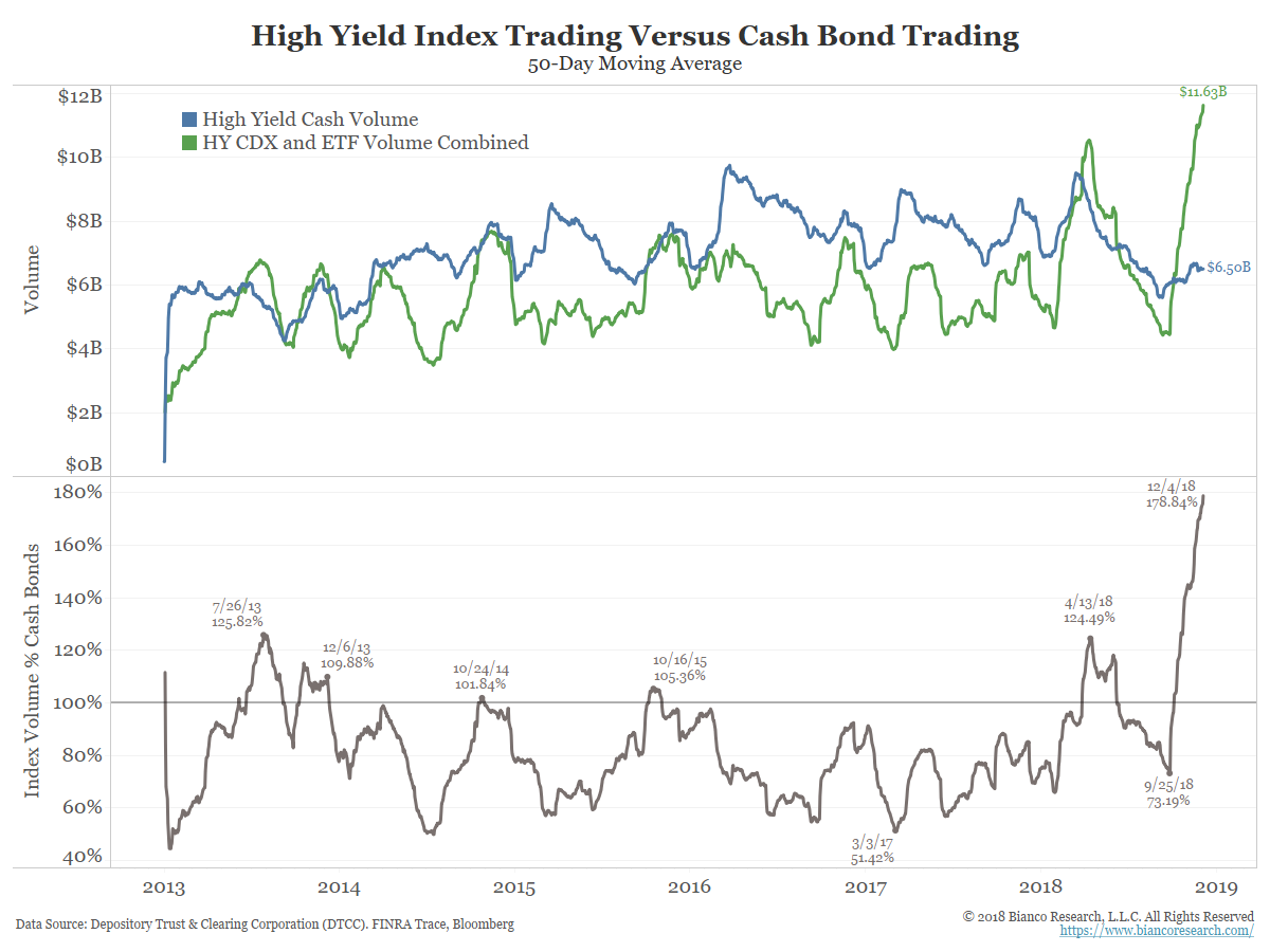
The blue line in the chart below shows the 50-day moving average of high yield bond volume currently stands at $6.30 billion, down from the March high of $9.5 billion.
The green line shows the 50-day value of all high-yield ETF trading. This totals about 30 ETFs. The orange line is the largest high-yield ETF, BlackRock’s iShares iBoxx High Yield Corporate Bond ETF (HYG).
The bottom panel shows high yield ETF dollar volume as a percentage of underlying cash volume. High yield ETFs (green) now account for almost 46% of the volume of the cash market. HYG alone is almost one-third the size of the high-yield market.
These metrics were essentially zero in 2008 while CDS and CDX were booming.
Putting it Together
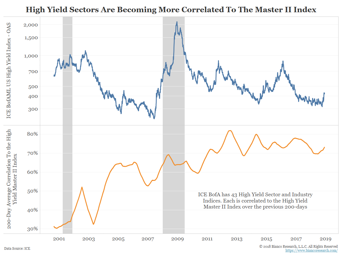
So how does this indexing show up in the markets? The next chart shows the OAS of the BofA/Merrill High Yield index (blue, top panel) and the intra-correlation of the 43 high yield industry groups.
Prior to the great recession, high yield industry groups were not terribly correlated to one another. Since 2011, however, their correlation has rarely fallen below 70%. We believe this increased correlation is due to the indexation effect.
The high yield market is extremely idiosyncratic. There are thousands of traders, analysts and portfolio managers making judgments on high yield bonds. They pour over covenants, business models, and cash flow projections with the goal of outperforming a benchmark index.
In other words, this is really a market of individual high yield bonds and not a high yield market. But macro CDX and ETF trading have taken a more prominent role in this market, resulting in higher correlations to the index.
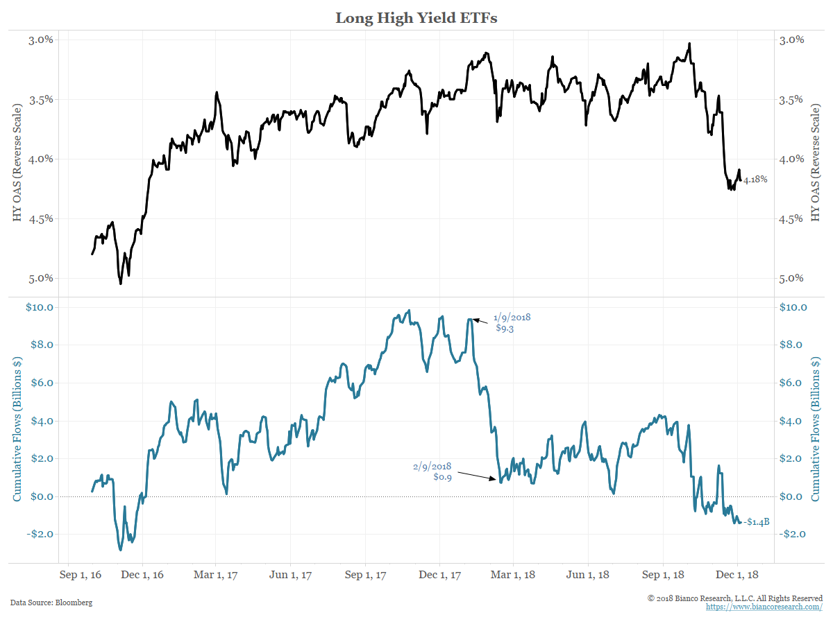
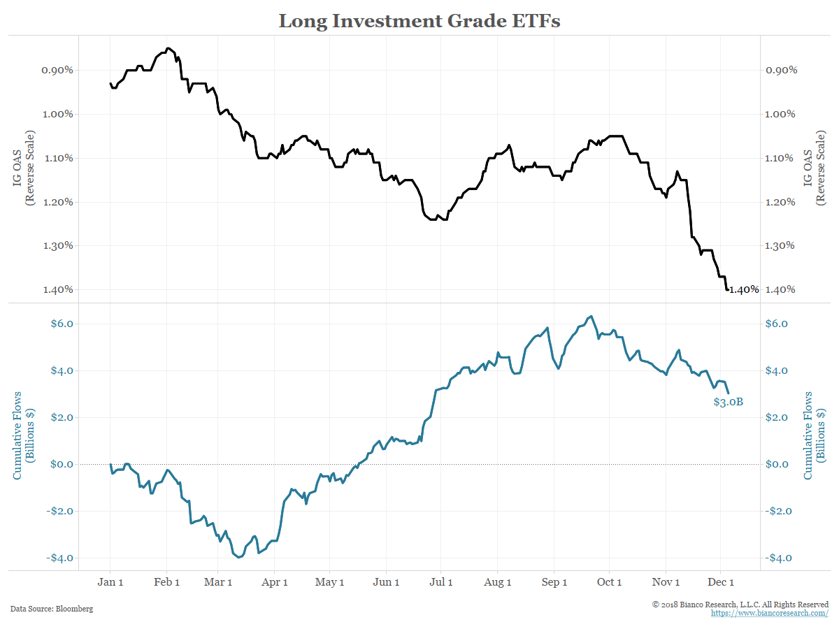
The next chart shows the cumulative flows into the 25 high yield bond ETFs (blue) peaked in late January with the stock market peak and declined with the 10% stock market correction in February. February saw $9 billion of inflows. However, even though high yield has performed far worse since September (black, top panel, plotted inversely to approximate price) the outflows have been relatively minimal.
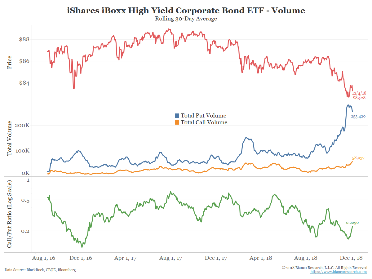
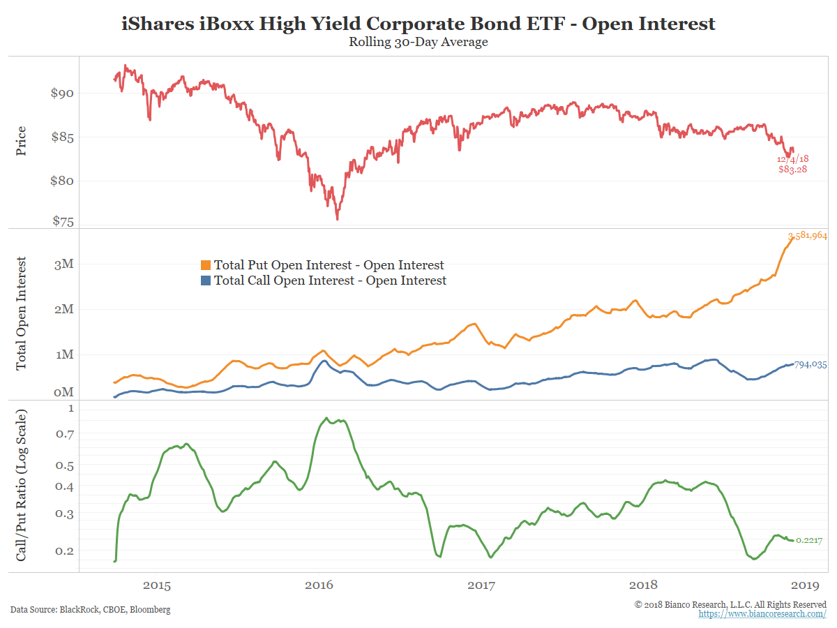
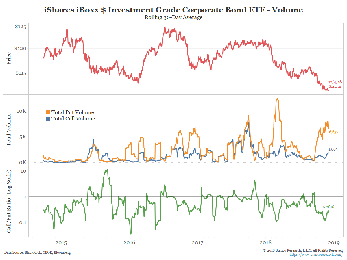
So what are traders doing? Selling puts!
As the chart below shows, options activity, and in particular put options volume (blue line, middle panel), has been spiking to levels never before seen. Instead of selling ETFs, put purchases are preferred.
Conclusion