- CNBC – David Rosenberg issues bubble warning in credit market: It will tear into stocks
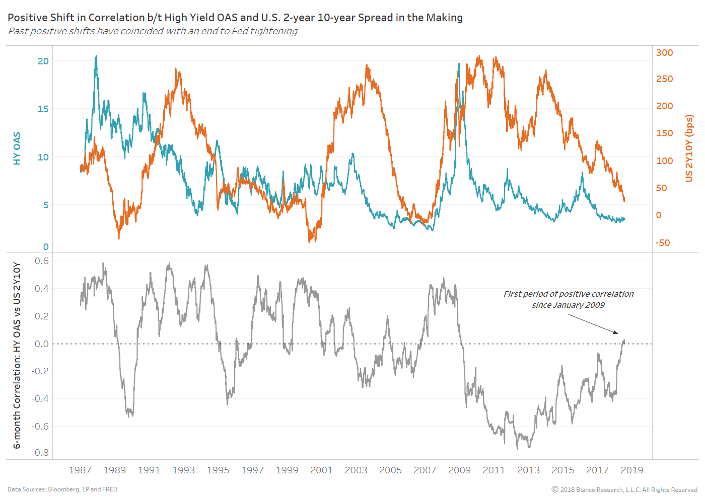
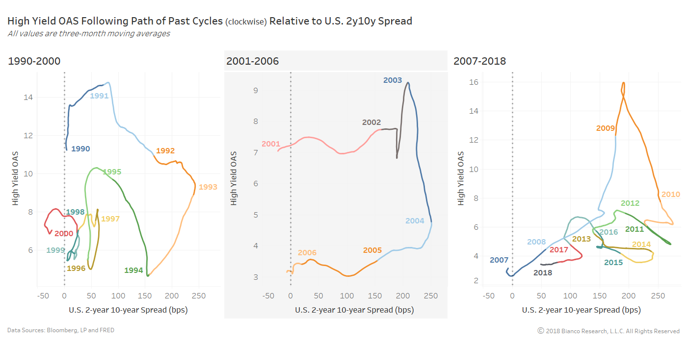
David Rosenberg is pretty certain he knows how the bull market in stocks will end. The Gluskin Sheff chief economist and strategist expects widening spreads will tear it apart. “The corporate bond market is today’s bubble, just like the mortgage market a decade ago was the bubble back then,” he said Monday on CNBC’s “Trading Nation.” Rosenberg, who referred to the corporate bond market as the “elephant in the room,” suggested that it’s just a matter of time until it blows up and puts stocks at risk. - Cycle between OAS and U.S. 2-year 10-year spread <- not yet complete
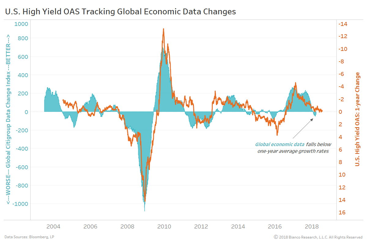
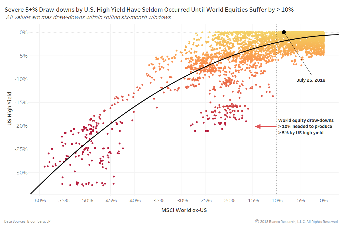
- Global economic data and equity drawdown <- Data slowing, drawdown threshold nearby
- Small business formation and lending <- Slowing, flashing red
Summary
Comment
The ultra-calm demeanor of U.S. high yield continues to make many nervous and anticipatory of tumult. We are watching three key items to determine when U.S. high yield OAS should finally widen. We want to hit the ‘trifecta’ before committing to a negative outlook for high yield:
For now, we can check off only one of these items, slowing small business formation and lending.
Cycle between OAS and U.S. 2-year 10-year spread
The chart below shows U.S. high yield OAS (blue) and U.S. 2-year 10-year spread (orange) in the top panel along with their rolling six-month correlation in the bottom panel.
U.S. high yield has yet to respond to an ever-flattening yield curve. However the period of negative correlation between OAS and the curve enduring post-crisis ended this month (July 2018). In other words, the positive economic sentiment driving rate hikes and a flatter curve have disconnected from junk bonds.
The chart below shows rolling 65-trading day correlation by asset class to the MOVE index.
High yield OAS has also shed its positive correlation to U.S. Treasury implied volatility, while other risk assets have strongly reconnected. Periods of negative correlation between U.S. high yield and Treasury volatility are rare and typically short-lasting.
Global economic data and equity drawdown
The rolling one-year change in U.S. high yield OAS (orange) has been very connected to the Citigroup Economic Data Change Index (cyan) throughout and after the financial crisis. The data change index measures incoming data releases relative to one-year averages. Above-zero indicate above-average growth and vice versa.
Global economic data changes fell below one-year average growth rates in late May 2018 after a favorable period of synchronized growth. Historically, drops by the global economic data change index to well-below zero have prompted widening high yield OAS. Therefore, the path of these economic data changes into the fall of 2018 will greatly impact high yield returns.
For now, economic data changes have yet to truly deteriorate, but we are watching closely.
The chart below shows this relationship between drawdowns (rolling six-month windows) by the MSCI World Index ex-U.S. versus U.S. high yield.
One of the best indicators of U.S. high yield producing a large 5+% drawdown has been global equities incurring their own drawdown in excess of 10%. Global equities are rebounding from a drawdown of 11.3%. This line in the sand remains close and again bears watching.
Small business formation and lending
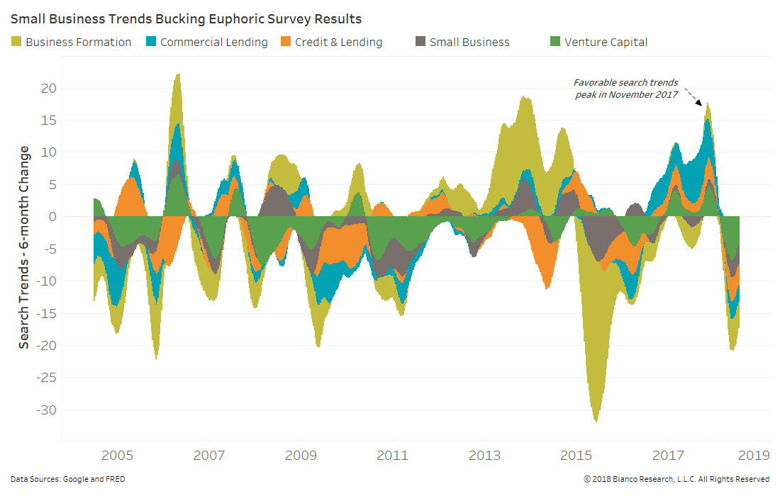
We prefer to assess consumer and business sentiment using Google search trends for a wide array of items and services. The chart below shows rolling six-month changes in global search trends for small business formation and lending.
Trends for formation and lending peaked in November 2017, leading to the largest retreat since early 2015.
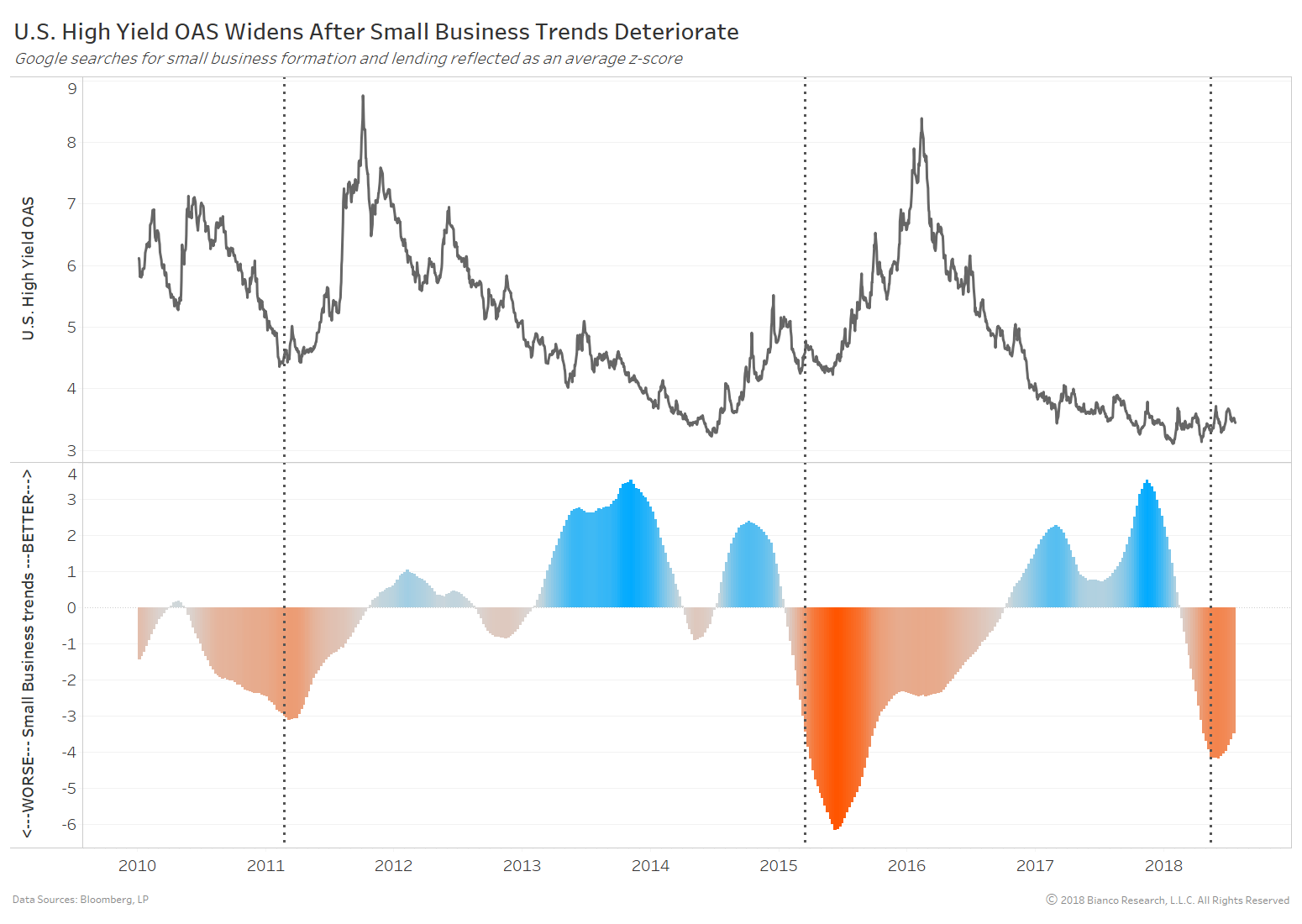
The last chart shows U.S. high yield OAS in the top panel and the average small business trend (z-score) in the bottom panel.
We have marked deteriorating trends to below -3 standard deviations with vertical dotted lines. The past two events were followed by rapidly widening OAS. Concerns about small business formation and lending are currently flashing red.

